Today we’re officially announcing the release of our beautiful, conversion optimized WooCommerce checkout design: Checkout for WooCommerce
A year ago we embarked on a mission to create a new checkout experience for WooCommerce that works with every theme and focuses on beautiful design and conversions first.
When you install Checkout for WooCommerce, your checkout page is completely replaced with a new, immersive design that is 100% focused on increasing sales:
How We Improve WooCommerce Checkout
The screenshot is beautiful, you may be telling yourself, but how does it help me make more sales?
Great question!
Checkout for WooCommerce optimizes for sales in a few key ways:
Easy Three-STEP Process
Long forms are daunting. Checkout forms that are carefully organized are easier to fill out.
Checkout for WooCommerce has customers focus on one aspect of their order at a time by placing related fields together, rather than throwing them straight into a long form.
A multi-step checkout process like the one Checkout for WooCommerce provides is actually a legal requirement for online stores in some countries, such as Germany.
We’ve road tested our design on stores that sell over 2 million dollars a year so we’re confident in its performance.
No Distractions
We believe the only purpose of the checkout page is to convert sales! Data shows that reducing distractions and avenues to leave increases sales.
You don’t need a header, menu bar, or footer. You need a beautiful, branded checkout design that is ruthlessly focused on one thing: making the sale!
Risk Free Refreshes
Checkout for WooCommerce actively save all field data in the user’s browser data storage as they fill fields (except for sensitive fields like credit card numbers!) so that we can instantly reload their entry on page load.
There’s nothing worse than filling out 80% of a long form and accidentally closing the browser tab or exiting the window, only to have to reenter all of that data.
Checkout for WooCommerce eliminates unnecessary distractions.
Automatic City and State Lookup
With almost no exceptions, every zip code on earth maps to a particular city and state or region. When customers type in their zip code on a Checkout for WooCommerce site, we instantly auto-populate their city and state.
If we get it wrong (which is a big IF!), we still let the customer set their own city and state.
Streamlined ACcounts
One of the most annoying aspects of purchasing online for new customers is creating an account.
We get why stores want all of their customers to have accounts, so we’ve made it as easy as possible. Customers can create a new account for your store by checking a single checkbox.
Checkout for WooCommerce sends an email with their login and password reset information upon successfully completing their order.
Smart Defaults
Most online purchases use the same billing and shipping address. By default, we assume that the billing and shipping addresses match and let the customer choose to add a separate address.
Color Inside The Lines – Or Out
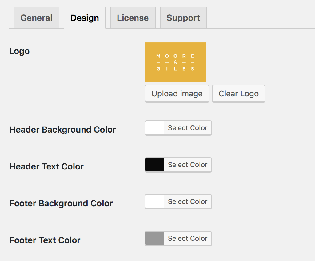
You can configure the look and feel of Checkout for WooCommerce, right from the design tab:
If you need more customizability, you can include your own CSS or even override the template files.
More Features
There are more features than we have time to list here. Here are some more features to check out:
You can view our full documentation here.
The Bottom Line
We believe all of these components will lead to more sales, more profits, and fewer headaches.
Making Checkout for WooCommerce the best checkout design and experience for WooCommerce is our top goal. We are listening to your feedback and we will be aggressively working to implement your features and suggestions to make Checkout for WooCommerce the best it can be.
Try It OUt Free
We’re so confident you’re going to love Checkout for WooCommerce, we’re launching it with a free 7 day trial, and a 45 day money back guarantee.
Try Checkout for WooCommerce Free for 7 Days
Not convinced yet? Give our demo site a spin!
View the Checkout for WooCommerce Demo


It sounds and looks really great but I still need the one page checkout plugin to let me use WooCommerce without my customers needing to view a product page, add to cart, go to checkout etc etc. The 1 page checkout is a great experience and you can even pass a product ID in the url so the cart is preloaded.
If you could do the same thing as 1 page checkout then your total solution would be just perfect.
Dale.
https://mydisabilitymatters.club
Hi Dale,
We can definitely add a URL parameter to pre-load the checkout with a given product.
Can you email me at clif@objectiv.co? I’d like to push an update to add this for you this week.
If I don’t hear back, I’ll reach out through your site.
Best,
Clif
Hi Dale,
We officially support the add-to-cart URL parameter now. You can test it on our demo site with this URL: https://demo.checkoutwc.com/checkout/?add-to-cart=56
I hope this gives you the functionality you need.
Clif
AMP compatible? https://ampbyexample.com/samples_templates/checkout_flow/